Type · sans serif
Gotham
Also called: Gotham font, Montserrat, American geometric sans, campaign poster sans, building signage lettering
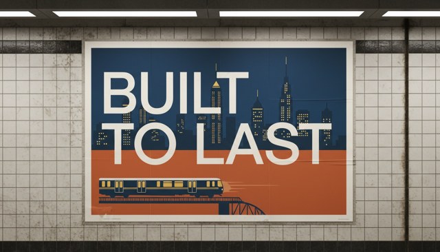
BUILT TO LAST
What it is
The American geometric sans drawn from mid-century building signage: wide, round capitals with an even stroke and no quirks. Political campaigns, sports brands and city wayfinding.
The prompt
Paste it into an image prompt that renders text, or use the font itself for titles.
Prompt
Gotham lettering, wide American geometric sans-serif capitals, even monoline stroke, round O, generous letter spacing, mid-century building signage voice, confident civic campaign poster
Not this
What it gets confused with, or how it fails. Use it as a negative prompt where the tool takes one.
Not this
Not Futura: these capitals are wider and the lowercase a has two storeys. Not Creator Hook Black: this sits at medium and bold, never black.
The details
- Font
- Montserrat (Google Fonts)
- Weights
- 500, 700
- Set for
- titles and captions
- Reel caption
- still legible as a phone-reel caption